UI Redux
Hello there world wide web! Today we decided to give an update on our Maze Editor app for macOS and what we’ve been working on.
Rework the UI, Why?
Well, as we were working on adding another major feature to the app, we ran into a problem where we weren’t happy with the way it was being implemented and wanted a more concise and consistent UI (User Interface).
Enter Sidebars
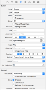
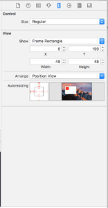
As we considered a different UI approach, it was suggested from our chat room that we utilize a UI similar to that of Xcode, where properties of different selections are presented to the user in a sidebar like interface
 |
 |
So we went to work attempting to move our popover UIs to sidebars, utilizing the 1 window interface most apps use these days.
Our sidebars
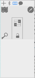
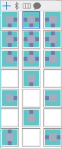
The following are examples of our current sidebars (graphics/layout may change)
 |
 |
Full UI
Here’s a screenshot of the full UI – Room Selection Sidebar (to change the room type)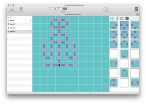
Here’s the sidebar for editing a selected room
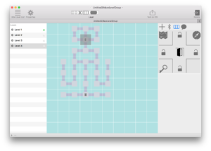
This allows for the user to edit levels using a 1 window UI and maximizing the window allows for focused editing. In the long run we are happier with this approach as behind the scenes it allows for us to, if we decided to again, change up the UI way easier, each sidebar is self contained and only knows details about the part of the document it needs to. Essentially it does one thing and does one thing well.
That’s all for now!
