The Editor
The next thing we had to decide on was: what UI are we going to present to the user when she is editing a level?
Well, it was relatively simple to come up with: a split view with a table on the left and the editor on the right. something like this:
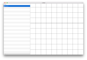
below the table would be add and delete level buttons (ideally the selected level) and later (as it was decided farther into development) add the share to device button, zooming in on the UI you could see that it looks like this:

but what would we make the editor look like when no level was selected? It’d look kind of bad if there wasn’t a level selected and the grid was still drawn… so we decided to make it very simple. Hide the editor view by default with some text that would let the user know what she must do to start editing:
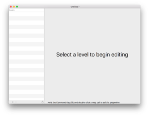
Level Properties
Next we looked into how we wanted to edit the selected level’s properties (such as display name, rows/columns in the grid and the level author) our first idea was to have the UI look something like this:
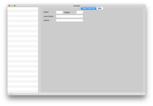
Ultimately we decided against that as:
- it wasn’t intuitive
- it wasted way too much space
Next we looked into using a utility window to show the level properties and we came up with something like this:
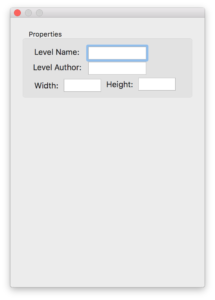
ultimately that was rejected due to it taking up too much space and having yet another window open (cluttering the UI even more) and knowing that the level properties would be something that would be displayed very temporarily on a per level basis, why would we want it in an always open window? Enter the macOS Popover window:
Popover Window
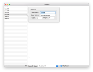
Here we see the level properties as Popover, with the properties button at the bottom of the editor window. Later on we adjusted the UI to show the properties button inside the cell next to the name of the level, which made the UI more concise.
That’s all for now!
