Comping up with the icon:
Sometimes the hardest part about making a new app is coming up with an app icon. It represents your application’s identity and what users will know your app by. It needs to be something simple that conveys what your app does. Generally it’s not a good idea to put words in said icons because they are usually viewed in the standard sizes of 32×32, 64×64 and even as small as 16×16…
The Icon:
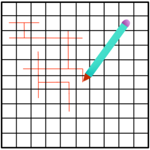
So for us, we are making an editor app for our iOS game, so we thought of using a simple grid with a pencil that makes it look like it’s drawing the maze. Here’s what we came up with:

It’s simple and to the point. Show’s that we are drawing a maze (or editing in this case) and conveys that message really well (at least in our opinion). For us the process was very simple, we fired up the awesome macOS app Pixelmator, a simple yet very powerful image editor, using the vector (or shape tools) made the grid and pencil and that’s what we came up with.
That’s all for now!
