Lately we’ve needed a small break from working on code and decided to work on the document icons (after the App Icon), we used a similar process to creating the app icon…
Document Icons
Maze Level Group icon
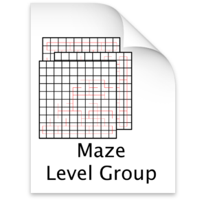
For our Level Group Icon we knew we wanted to have an icon that was very similar to the app icon so that by just glancing at the icon, you could tell what app it belongs to. We came up with the following for the Maze Level Group:

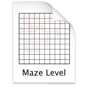
For our Level file icon we decided to go with something similar to the Maze Level Group icon, so agin that the document is recognizable at a glance. This is what we came up with:

Maze Level List Icon
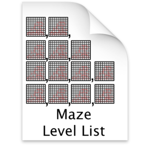
For the level list icon we came up with this:

Icon design tips
In our limited experience, it’s best to design a document icon, when directly associated with your app (as opposed to icons of file types your app can open, such as importing to convert to your custom format or just importing to view the data), after your App Icon but still conveying what it is, as with our document icons each of our files show that they are associated with the Maze Editor app but don’t look exactly like the app icon on top of a generic document icon.
That’s all for now!
